
Remember me
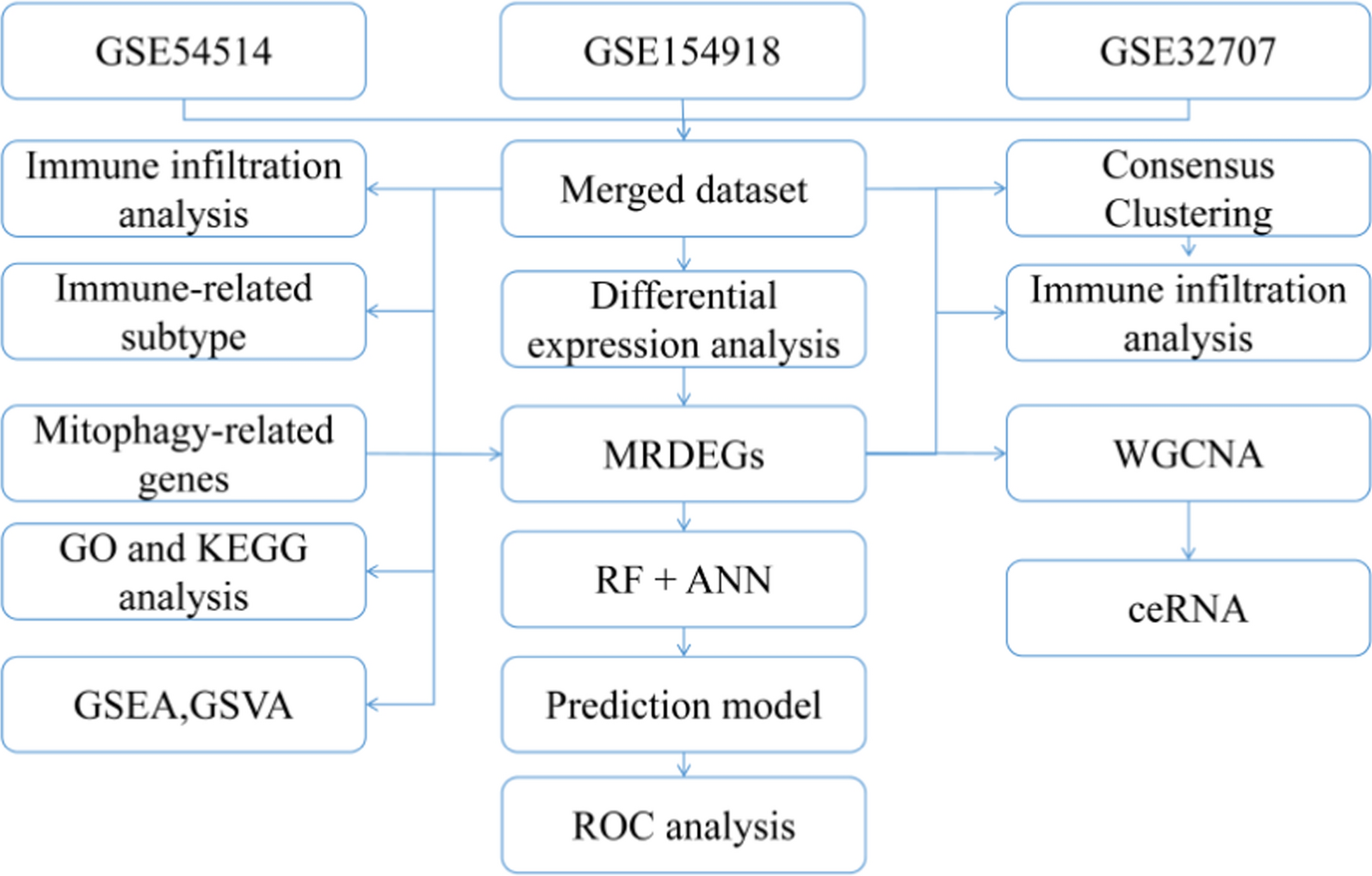


The flowchart illustrates the complete research framework for obtaining data from the GEO database (GSE54514, GSE154918, and GSE32707), integrating and analyzing it. First, the three datasets are merged, and differential expression analysis is conducted to screen for key differential genes related to sepsis (MRDEGs). Subsequently, these genes are used for enrichment analysis (GO and KEGG) and immune infiltration analysis, while GSEA and GSVA are employed to explore potential biological pathways. The study further classifies immune subtypes based on consensus clustering and explores key gene modules in conjunction with WGCNA (Weighted Gene Co-expression Network Analysis). Additionally, predictive models are constructed using Random Forest (RF) and Artificial Neural Networks (ANN), followed by ROC curve analysis to evaluate model performance. At the same time, the ceRNA (competitive endogenous RNA) network is integrated to study gene regulatory mechanisms, comprehensively revealing the molecular characteristics of sepsis (Fig. 1).
Fig. 1
Analysis flow chart. M.DEGs, Mitophagy-related differentially expressed genes. WGCNA, weighted gene correlation network analysis. RF, random forest. ANN, artificial neural network. GO, gene ontology. KEGG, kyoto encyclopedia of genes and genomes. ROC, receiver operating characteristic. GSEA, gene set enrichment analysis. GSVA, gene set variation analysis
Data set pre-processingThe ischemia–reperfusion expression profile data GSE154918, GSE32707, and GSE54514 were downloaded from GEO. Satasets were standardized using the “normalizeBetweenArrays” feature in the R software package “limma”, while the three expression profile data were batch calibrated and merged using the “Combat” feature in the R software package “sva” [53]. Results are presented through box-line plots and the first two principal component point plots of PCA. After normalization, we observed similar distributions of gene expression profiles between the three datasets (Fig. 2A and B). The batch effects of the three datasets were corrected (Fig. 2C and D), allowing for subsequent analysis.
Fig. 2
Comparison of gene expression distribution before and after bulk calibration for the GSE154918, GSE32707, and GSE54514 datasets. Box plots of gene expression distribution A before and B after bulk calibration; PCA C before and D after bulk calibration. PCA, principal component analysis
Correlation analysis of immunoinfiltrationThe CIBERSORT algorithm was used to calculate the levels of 22 immune cell types in the different samples, shown by plotting stacked bar graphs (Fig. 3A). Removal of immune cells with an abundance of 0 (resting dendritic cells) and A Wilcox test algorithm were used to allow comparison of immune cell infiltrates between the control and sepsis conditions. Results showed 11 types of immune cells (B cells naïve, plasma cells, resting T CD4 memory cells, regulatory T cells (Tregs) gamma delta T cells, resting NK cells, monocytes, M0 macrophages, resting mast cells, activated mast cells, eosinophils, and neutrophils) significantly expressed in the two groups. The infiltration level of resting T CD4 memory cells, resting NK cells, and neutrophils was significantly increased in the sepsis group (Fig. 3C). This suggests that the above mentioned immune cells might play an essential role in sepsis. Correlation analysis in the sepsis dataset revealed that gamma delta T cells and M0 macrophages (R = 0.26, P < 0.05) showed a distinct correlation at higher infiltration levels in the sepsis group, whereas resting T CD4 memory cells and resting NK cells showed correlation at lower infiltration levels (R = 0.36, P < 0.05). Furthermore, neutrophil and monocyte counts (R = − 0.49, P < 0.05) showed a significant positive correlation, and resting NK cells and gamma delta T cells (R = − 0.47, P < 0.05) showed a significant negative correlation (Fig. 3B).
Fig. 3
GSE154918, GSE32707, and SE54514 combined dataset analysis for immune cell infiltration (Samples in Sepsis group; N = 205, Samples in Normal group; N = 110). A Bar chart of 21 immune cell types in different samples of the dataset, represented by distinct colored bars. B Correlation analysis between various immune cell types in the dataset. The colors represent the strength of the correlation, with redder colors indicating a stronger correlation. C Differences in the abundance of the 21 immune cell types enriched in the dataset. The control group is indicated in orange color and the sepsis group in purple. The horizontal axis indicates the 21 immune cell types and the vertical axis the abundance of immune cell infiltration. ns: P > 0.05, * P < 0.05, ** P < 0.01, *** P < 0.001, **** P < 0.00001
Immunological signature subtype analysisWe calculated the abundance of 28 immune cell infiltrates in disease-group samples using the ssGSEA algorithm and then performed immune profiling of sepsis samples using unsupervised consistent agglomerative clustering, based on the immune cell infiltration abundance matrix. With this analysis we identified two different subtypes (Fig. 4A), with cluster1 containing 93 disease group samples and cluster2 containing 112 disease group samples. Figure 4B and C show the cumulative distribution function (CDF) plots of the consistent clustering results for different numbers of clusters and the area under the CDF curve delta plots. As shown in Fig. 4A, the most consistent clustering results were obtained when k = 2 was used as the clustering number for supervised clustering. We then performed principal component analysis (PCA) on the expression matrix of the dataset for the two disease subtype samples, and the PCA clustering results showed significant differences between the two disease subtype samples (Fig. 4D).Expression of mitochondrial autophagy-associated genes in the two different subtypes are shown by grouped comparison plots, volcano plots, and heatmaps (Fig. 4E and F), with |logFC|> 0.2 and P < 0.05 as thresholds for statistical differences. This analysis showed 4 upregulated (MAP1LC3B, HIF1A, MFN2, and ATG7) and 11 downregulated genes (UBA52, SRC, TOMM7, SQSTM1, PHB, VDAC1, OPTN, UBB, TOMM22, TOMM40, and RPS27A).We also analyzed the variation of immune cell imbibition in the two characterizing subtypes, revealing that most immune courts differed clearly in both subtypes (Activated B cells, Activated CD4+ T cells, Activated CD8+ T cells, Central memory CD4+ T cells, Effector memory CD4+ T cells, Effector memory CD8+ T cells, Immature B cells, Memory B cells, Regulatory T cells, T follicular helper cell, Activated dendritic cell, CD56 dim NK cell, Eosinophil, Macrophage, Mast.cell, Myeloid-derived suppressor cell (MDSC), NK cell, and neutrophil) (Fig. 4G, P < 0.05).
Fig. 4
Immune signature subtyping. A Consistent clustering plot (k = 2) results for the immune infiltration matrix. (B, C) CDF of consistent clustering plot for different numbers of clusters (B), and area under the CDF curve (C). D PCA of the two clusters, cluster1 colored in yellow and cluster2 in purple. E Key genes expression profiles in different immune signature subtypes. Red indicates up-regulated genes, cyan shows down-regulated genes. F: Heatmap of key gene expression, horizontal coordinates are mitochondrial autophagy-related genes, vertical coordinates are different immune signature subtypes. Red represents high gene expression, cyan represents low gene expression. G Comparison of gene expression in different immune cells in the two clusters; horizontal coordinates indicate cells, vertical coordinates indicate infiltration levels. Yellow color represents cluster1, purple represents cluster2. ns: P > 0.05,* P < 0.05, ** P < 0.01, *** P < 0.001, **** P < 0.0001. PCA, principal component analysis; CDF, cumulative distribution function
Differential expression and enrichment analysesTo analyze the differential gene expression profiles between control and sepsis groups, we performed a differential analysis of the combined dataset, taking the intersection of mitochondrial autophagy-related genes with sepsis DEGs. We found 8 differentially up-regulated genes in the sepsis group (TOMM20, HUWE1, SQSTM1 TOMM40, HIF1A, UBA52, PGAM5, and VPS13C) and 6 genes differentially expressed down-regulated in the sepsis group (HTRA2, ATG12, ATG7, MAP1LC3B, ATG9A, and MAP1LC3A). To analyze the biological functions associated with these differentially expressed mitochondrial autophagy, we characterized the 14 genes in terms of: BP, MF, CC, and biological routes (Tables 2 and 3). These genes were primarily correlated to entries for molecular functions such as macroautophagy, mitochondrial autophagy, mitochondrial disassembly, binding of ubiquitin protein ligases, binding of ubiquitin-like protein linkers, and protein transmembrane transporter activity, as well as entries for cellular components such as the site of phagosome assembly, autophagosome, and outer mitochondrial membrane (Fig. 5A, B). KEGG analysis revealed that differentially expressed mitochondrial autophagy-related genes were correlated with mitophagy (Fig. 5A, C), ferroptosis (Fig. 5A, D), the NOD-like receptor signaling pathway (Fig. 5A, E), and other biological pathways.
Table 2 Hub genes GO analysis: Based on GO databaseTable 3 Hub genes KEGG analysis: Based on KEGG databaseFig. 5
Functional enrichment analysis. A GO and KEGG functional enrichment analysis: horizontal coordinates are different GO entries enriched with the differentially expressed mitochondrial autophagy-associated genes; vertical coordinates are -log10(P value). Red color indicates biological processes, green indicates cellular components, dark blue indicates molecular functions, and light blue indicates enriched biological pathways. B Circle diagram of GO enrichment pathways, divided in an inner and outer part. Each bar in the inner circle corresponds to an entry and the height is the relative size of the adjusted p value, the higher it is the smaller the adjusted p value for that ID. C Mitophagy—animal pathway, D Ferroptosis pathway, and E NOD-like receptor signaling pathway. Each node indicates a key gene in the pathway. The color of the node is determined by log2FC, with green indicating differentially down-regulated genes and red indicating differentially up-regulated genes. GO, gene ontology; KEGG, Kyoto encyclopedia of genes and genomes; BP, biological process; CC, cellular component; MF, molecular function
GSEA and GSVATo identify the impact of gene expression in sepsis, we analyzed the biological pathways impacted by the studied genes in the healthy controls and sepsis groups (Fig. 6A). Results showed that the toll-like receptor signaling pathway (Fig. 6B), the RIG-I-like receptor signaling pathway (Fig. 6D), and the NOD-like receptor signaling pathway (Fig. 6E) were upregulated in the sepsis group. In contrast, biological pathways such as the TGF-β signaling pathway (Fig. 6C) were downregulated in the sepsis group (Table 4). We performed GSVA to determine differences in the pathways between the sepsis and healthy control groups. The results showed that sepsis mainly affected,SMID_BREAST_CANCER_ERBB2_DN,KIM_PTEN_TARGETS_DN,MYLLYKANGAS_AMPLIFICATION_HOT_SPOT_30,CHESLER_BRAIN_D6MIT150_QTL_CIS,BIOCARTA_CIRCADIAN_PATHWAY, MYLLYKANGAS_AMPLIFICATION_HOT_SPOT_18,ZHENG_RESPONSE_TO_ARSENITE_DN,FARMER_BREAST_CANCER_CLUSTER_6,LUDWICZEK_TREATING_IRON_OVERLOAD,MARTINELLI_IMMATURE_NEUTROPHIL_UP,TOMIDA_LUNG_CANCER_POOR_SURVIVAL,MIKKELSEN_IPS_LCP_WITH_H3K4ME3_AND_H3K27ME3,REACTOME_INTESTINAL_ABSORPTION, BIOCARTA_PEPI_PATHWAY and other biologically relevant pathways (Fig. 6F, Table 5).
Fig. 6
GSEA and GSVA(Samples in Sepsis group; N = 205, Samples in Normal group; N = 110). A Mountain range plot of GSEA results for the healthy versus sepsis groups. B–E GSEA visualization; x-axis represents the rank of DEGs up-regulated (greater than zero) and down-regulated (lower than zero), the upper y-axis refers to the enrichment score and the lower y-axis is the logFC value. Each color represents a pathway: Toll-like receptor signaling pathway (B), RIG-I-like receptor signaling pathway (D), and NOD-like receptor signaling pathway (E), upregulated in the sepsis group; and TGF-β signaling pathway (C), down-regulated in the sepsis group. (F) GSVA enrichment results; vertical coordinates represent different gene set entries and horizontal coordinates represent different samples. Yellow annotation bars indicate the control group and purple bars indicate the sepsis group. GSEA, gene set enrichment analysis; GSVA: gene set variation analysis
Table 4 Sepsis vs Control GSEA: Based on c2.cp.kegg.v7.4. entrez.gmt databaseTable 5 Sepsis vs Control GSVA: Based on c2.all.v7.5.1.symbols.gmt databaseClinical diagnostic modelTo construct a diagnostic model for sepsis, we entered 14 differentially expressed mitochondrial autophagy-associated genes into a random forest algorithm to measure their importance (Fig. 7A). The Gini index is commonly used as a gene importance measure, so we used a stochastic algorithm to rank the differentially expressed mitochondrial autophagy-related genes. We selected genes with importance greater than 0 for further neural network construction (Fig. 7B), with a total of 14 genes (HIF1A, HTRA2, ATG7, ATG9A, ATG12, MAP1LC3A, MAP1LC3B, PGAM5, SQSTM1, TOMM20, TOMM40, UBA52, HUWE1, and VPS13C). The final model consisted of an input level of 14 variables, a concealed level of 5 variables, and an outcome level for binary classification (Fig. 7D). Using this ANN model, the AUC value was 0.900 (Fig. 7C), indicating that the model was suitable for sepsis diagnose.
Fig. 7
Construction of the clinical prediction model(Samples in Sepsis group; N = 205, Samples in Normal group; N = 110). A Relationship between the number of decision trees and the error of cross-validation; vertical coordinates indicate the error, and horizontal coordinates indicate the number of decision trees. The green line shows the error for the control group, the red line shows the error for the sepsis group, and the black line shows the error for all samples. B Scatter plot of gene importance in random forest variables; the mean falling Gini index at the horizontal coordinate and the different genes at the vertical coordinate. C ROC curves; horizontal coordinates define specificity, vertical coordinates define sensitivity, area under the curve and 95% confidence intervals are annotated in the lower right corner of the Fig D: From left to right, the nodes indicate the input layer, hidden layer, and different groupings of the neural network. The grey lines represent negative connection weights and the black lines represent positive connection weights. ROC, receiver operating characteristic
Immune cells infiltration correlationsTo analyze the biological link between key mitochondrial autophagy-related genes and the immune microenvironment in sepsis, we used the ssGSEA algorithm. Results showed a significant correlation between key mitochondrial autophagy-related genes and a variety of immune-infiltrating cells in sepsis (Fig. 8A). Of these, activated dendritic cells were significantly correlated with all key genes and were more strongly correlated with, HIF1A (Fig. 8B, R = 0.3), HTRA2 (Fig. 8C, R = 0.48), ATG7 (Fig. 8D, R = 0.58), MAP1LC3A (Fig. 8E, R = 0.41), PGAM5 (Fig. 8F, R = -0.46), TOMM20 (Fig. 8G, R = -0.45), UBA5290 (Fig. 8H, R = -0.4), and HUWE1 (Fig. 8I, R = -0.5). These observations suggest that immune cell infiltration by activated dendritic cells might play an instrumental role in the progression of sepsis.
Fig. 8
Immune cells infiltration correlation. A Heatmap showing the correlation analysis between mitochondrial autophagy-related key genes and immune cells in sepsis; the horizontal axis indicates different immune cells and the vertical axis indicates mitochondrial autophagy-related key genes in sepsis. The more intense the red color, the stronger the correlation between the genes and immune cells. B HIF1A, C HTRA2, and D ATG7 correlation with activated dendritic cells; horizontal coordinates are the expression level of each gene and vertical coordinates are the ssGSEA enrichment score of activated dendritic cells. Scatterplot of the correlation between genes MAP1LC3A E, PGAM5 F, TOMM20 G, UBA5290 H, HUWE1 I and activated dendritic cells. ns: P > 0.05, * P < 0.05, ** P < 0.01, ***P < 0.001, **** P < 0.0001. Correlation coefficients (r) > 0.8 are strongly correlated; r: 0.5–0.8 are moderately correlated; r: 0.3–0.5 are weakly correlated; r < 0.3 are weakly or not correlated
Molecular typingTo explore the subtypes associated with mitochondrial autophagy in sepsis, we used expression profile data of key genes associated with mitochondrial autophagy in sepsis to subtype a comprehensive dataset of sepsis patients by unsupervised consistent clustering. We identified two distinct subtypes (Fig. 9A), cluster1, comprising 123 sepsis samples, and cluster2, comprising 82 sepsis samples. Figure 9B and C show the CDF plots and the area under the CDF curve delta plots for the different numbers of clusters. PCA of the samples revealed that cluster1 and cluster2 could be distinguished from each other (Fig. 9D). Moreover, the 14 key genes (HIF1A, HTRA2, ATG7, ATG9A, ATG12, MAP1LC3A, MAP1LC3B, PGAM5, SQSTM1, TOMM20, TOMM40, UBA52, HUWE1, and VPS13C), with the exception of SQSTM1, had 13 genes in both isoforms with significant differences (Fig. 9E and FP < 0.05). Of these, HIF1A, HTRA2, ATG7, ATG9A, ATG12, MAP1LC3A, and MAP1LC3B were significantly down-regulated in cluster2, and PGAM5, TOMM20, TOMM40, UBA52, HUWE1, and VPS13C were significantly up-regulated in cluster2.
Fig. 9
Molecular typing and immune infiltration. A Plot of consistent clustering (k = 2) results for the immune infiltration matrix. B, C Plot of the cumulative distribution function of consistent clustering for different numbers of clusters (B), and area under the CDF curve delta plot (C). D PCA of the two clusters, cluster1 is represented in yellow and cluster2 in purple. E Heatmap of key gene expression; horizontal coordinates are key genes associated with sepsis mitochondrial autophagy and vertical coordinates are different subtypes of sepsis. Red represents high gene expression, cyan represents low gene expression. F Comparison of key genes expression in the two clusters; horizontal coordinates represent genes and vertical coordinates represent gene expression. Cluster1 is represented in yellow and cluster2 in purple. ns: P > 0.05,* P < 0.05, ** P < 0.01, *** P < 0.001, **** P < 0.0001
Analysis of immune infiltration in sepsis subtypesIn order to investigate differences in the immune cell infiltration in the different subtypes of sepsis, we calculated the abundance of immune cells for 22 immune infiltrates in disease and control sample using the CIBERSORT algorithm (Fig. 10A) and then compared the differences in immune cell abundance in disease subtypes (Fig. 10B). We found significant differences in immune cell types infiltration between the different disease subtypes, the more significant being plasma cells, CD8+ T cells, regulatory T cells (Tregs), gamma delta T cells, resting NK cells, M0 macrophages, M2 macrophages, activated mast cells, eosinophils and neutrophils (P < 0.05).
Fig. 10
Immune infiltration analysis. A Bar plot displaying the immune infiltration analysis in different subtypes of sepsis, in the combined dataset. B Comparison of the 22immune cell infiltrates in sepsis cluster1 and cluster2. ns: P > 0.05, * P < 0.05, ** P < 0.01, *** P < 0.001, **** P < 0.0001)
Analysis of key genes associated with mitochondrial autophagy in sepsisFurther analysis gene expression of key genes involved in mitochondrial autophagy in sepsis revealed clear differences in both sepsis and control samples (Fig. 11A, P value < 0.05). With logistic regression profiling of the 14 genes and the findings revealed by forest plots, SQSTM1, TOMM20, HUWE1, HIF1A, UBA52, PGAM5, VPS13C, and TOMM40 were located on the left-hand side of the null hypothesis line and considered as protective genes for sepsis. On the opposite, HTRA2 was located on the right-hand side of the null hypothesis line and was found to be an unfavorable factor for sepsis (Fig. 11B). These 14 genes were also evaluated by Calibration and decision curve (DCA) analyses. The x-axis in the DCA plot (Fig. 11C) represents the probability throw, and the y-axis represents the net gain. The prediction line (dashed line) of the model constructed based on the 14 genes was steadily higher than the All and None lines based on the range of x-values to determine the clinical effect, with a larger range of x-values being more effective. The clinical effect was better. The main function of the calibration curve graph (Fig. 11D) was to assess the diagnostic accuracy of the disease. The fitted curve in Fig. 11D shows a high overlap with the prediction curve (dashed line), indicating that the 14 genes are good disease predictors and may be potential therapeutic markers for sepsis diagnosis.
Fig. 11
Analysis of key genes associated with mitochondrial autophagy in sepsis (Samples in Sepsis group; N = 205,Samples in Normal group;N = 110). A Grouped comparison plot of the selected 14 genes in the sepsis and control groups. B Forest plot of 14 genes by logistic regression analysis to calculate clinical and disease predictive effects, demonstrated by DCA plots (C) and calibration curves (D). ns: P 0.05, * P < 0.05, ** P < 0.01, *** P < 0.001, **** P < 0.0001. DCA: decision curve analysis
WGCNABy exploring the co-expression of genes in profiles of the sepsis group, using the R package “WGCNA”, we constructed co-expression modules using the top 5,000 genes in this dataset. The samples were clustered using Pearson’s correlation coefficients in combination with the clinical information of the patients (Fig. 12A). Next, we set a soft threshold of 9 to construct a scale-free network (Fig. 12B), where R2 > 0.85, and network connectivity was high. Finally, we set the smallest module number of genes to 50 and the combined module cut height to 0.2, to calculate the eigengenes. Using the dynamic cut tree algorithm, we obtained a total of 17 gene co-expression blocks, divided into different colors (Fig. 12C). We then analyzed the correlation between the different modules and the sepsis group (Fig. 12D). The light cyan and turquoise modules were positively correlated with the sepsis group (P < 0.05), with the turquoise module having the strongest correlation (r = 0.34, P = 6e-10). The red module was negatively associated with sepsis (r =—0.28, P = 3e-07). We chose the turquoise module, to intersect with the differentially expressed mitochondrial autophagy genes, and obtain 2 interest genes (ATG7 and HTRA2) (Fig. 12E).
Fig. 12
WGCNA based on the gene expression spectrum of the dataset. A Sample clustering was used to detect anomalous samples; each branch represents 1 sample and the red box in the sample information indicates the category of each sample. B Scale-free topological model fit (left) and mean connectivity (right), used to determine the best soft threshold. The horizontal coordinate of the left panel indicates the soft threshold of fit and the vertical coordinate indicates the level of fit (R-squared) in the scale-free topological model. The right panel indicates the soft threshold of fit in horizontal coordinates and the average connectivity between modules in vertical coordinates. C Dynamic shear clustering tree for different genes. The upper tree shows gene co-expression, with each gene represented by a leaf in the tree and each module represented by a main trunk branch. The lower colored bars indicate the corresponding 17 modules, labelled in the indicated colors. D Heatmap of the correlation between different modules and the sepsis group; x-axis refers to sample classification and y-axis to the module color. Red in the correlation heatmap indicates positive correlation and dark blue indicates negative correlation. Textual meanings of the color blocks in the heatmap: Pearson correlation coefficient in the upper part; statistical p-value in the lower brackets. E Turquoise module genes and mitochondrial autophagy differential genes intersection
Construction of ceRNA networks for key genesTo explore the potential ceRNA regulatory network of key genes, we first entered the previously selected key genes into the miRcode database to obtain miRNAs that might target the key genes associated with mitochondrial autophagy in sepsis (total score > 50). Next, we predicted the lncRNAs to which the selected miRNAs might bind, selecting only miRNA-lncRNA relationships with high scores (total score > 70). Finally, by integrating mRNA-miRNA and miRNA-lncRNA interaction pairs, we obtained a hub gene-associated ceRNA regulatory network consisting of 23 miRNAs, 2 mRNAs, and 95 lncRNAs, visualized using the Cytoscape software (Fig. 13A). Our “cytoHubba” plug-in clustered the ceRNA interaction network and identified key modules within it. We identified a key ceRNA module (Fig. 13B) that suggested ATG7 as an important player in sepsis.
Fig. 13
ceRNA network construction for hub genes. A Key genes-associated ceRNA network construction based on the miRcode database; green nodes indicate mRNAs, pink nodes indicate miRNAs, and yellow nodes indicate lncRNAs. B Clusters of key genes-associated ceRNA networks, with square ones for mRNAs, prismatic ones for miRNAs, and round ones for lncRNAs
Validation of autophagy-related genes in sepsisThe 14 hub genes were further validated by quantitative PCR (Fig. 14), and the two groups were statistically significant in ATG9A (Fig. 14C), HTRA2 (Fig. 14E), HUWE1 (Fig. 14F), MAP1LC3A (Fig. 14G), MAP1LC3B (Fig. 14H), SQSTM1 (Fig. 14J), TOMM40 (Fig. 14L), UBA52 (Fig. 14M).
Fig. 14
PCR of hub genes. A PCR of ATG12 gene in control and sepsis groups. B PCR of ATG7 gene in control and sepsis groups. C PCR of ATG9A gene in control and sepsis groups. D PCR of HIF1A gene in control and sepsis groups. E PCR of HTRA2 gene in control and sepsis groups. F PCR of HUWE1 gene in control and sepsis groups. G PCR of MAP1LC3A gene in control and sepsis groups. H PCR of MAP1LC3B gene in control and sepsis groups. I PCR of PGAM5 gene in control and sepsis groups. J PCR of SQSTM1 gene in control and sepsis groups. K PCR of TOMM20 gene in control and sepsis groups. L PCR of TOMM40 gene in control and sepsis groups. M PCR of UBA52 gene in control and sepsis groups. N PCR of VPS13C gene in control and sepsis groups
Comments (0)